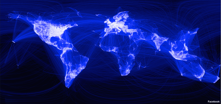
This is a map of Facebook’s world. It was created by Paul Butler, an intern working for the company. It seems quite clearly influenced by those NASA Earth at night images, or those cybergeography maps of Internet connection, and it’s not surprising that the distribution of points is similar.
 Butler’s view of this is that:
“It’s not just a pretty picture, it’s a reaffirmation of the impact we have in connecting people, even across oceans and borders.”
Well, yes and no. If you are a flag-waving Facebook utopian or an uncritical naif, then yes, that’s what it could be. But all maps are political and express political economies. For a Facebook executive, this is a map of markets, both current and unexploited. For anyone interested in the ‘digital divide’ and global social justice, this is yet another map of global inequalities, of power, and of uneven access to resources: Africa is still ‘the dark continent’ in the way this data is visualized. Politically, it is also a map of a particular kind of American-centred global power. Whilst it reflects the rise of India and Brazil to some extent (South Americans tend to use other social networking tools like Orcut) or , it also shows how disengaged from this nexus are Russia and China, which have their own networks (and in the latter case, signifcant control over social networking). But essentially, you can see this as a map of contemporary US influence as much as anything.
And, of course, finally, it is also Facebook saying to all of us: “We know where you live!” 😉


What a wonderful picture when viewed from an artistic perspective!
It quite made me smile.
Definitely very beautiful, although if we are to pursue an artistic critique, it is perhaps rather derivative of the NASA earth by night portrayals.